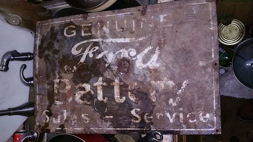
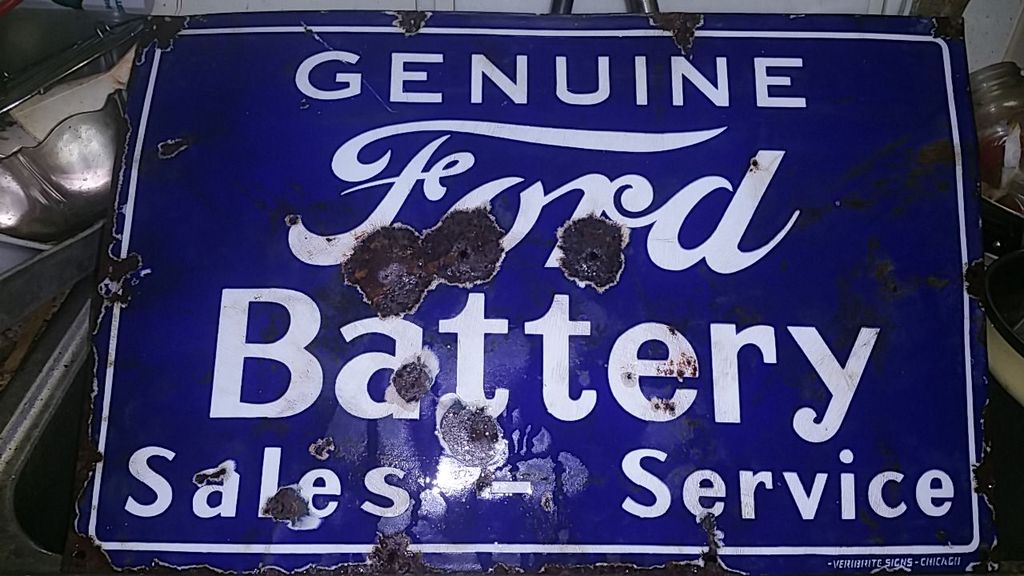
That sign is in the known reproductions / fantasy forum in old gas, just click on that and you'll see this sign, minus the dents and rust.
The patina on this sign seems pretty well done, scary. Not the typical beat down with a hammer.
For me, what jumps out at me is the "F", the narrowness of it and also the way it steps in the tail of the "F". I wouldn't expect a vintage error to look like that. The letters are kind of "joggy" like generated by computer. I sometimes make Repro stickers by taking pics of the real thing and "vectorizing" it on my computer. The outline of the letters has the same look I see post vectorizing. It's the error the computer makes in generating a curve, instead the computer creates a series of lines that jog ever so slightly at their end points.
Sorry! I know this sucks.
Last edited by Paul Bell; Mon Oct 12 2015 02:18 AM.