Dave makes a good point about the graphics on the Coop map. You will start to notice that the 20's and early 30's art is generally more stylistic during the Art Deco period. As you get into the 60's and especially 70's there is a modern influence that just doesn't have the same impact as the early graphic designs. If you think about it, that carries over to the globes, signs and gas pumps, which is what makes the pumps and logo signs less interesting to collect from those later periods.
Perhaps the youngsters will have a greater appreciation for that "Modern" stuff, but this is what I like...
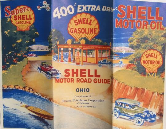 Thanks again to Robert Stephens for this Shell beauty. And thanks to all of you that are supporting this post.
Heat up those scanners!


